16 WorkflowR example
In this example we will open the index.Rmd file using wflow_open function
wflow_open("analysis/index.Rmd")At this file you can update the title of the index page, and start writing the main objectives of this repository. Like:
This repository was created to assist my learning experience with Git Hub and workflowr.

My first R code at this project will be at this [git hub page](PCA.html)
That’s great, but we still do not have the PCA.html file, so let’s create it with the wflow_open function.
wflow_open("analysis/PCA.Rmd")That should create the PCA.Rmd file, you should be looking for it now.
You can update the name to replacing the abbreviation for Principal Components Analysis, and add a new intro for the analysis that we are going to do at this R markdown file.
In PCA.Rmd we will make a Principal components analysis of the famous iris data from Ronald Fisher. So fell free to start your R markdown file.
16.2 Preparing data for the principal components analysis (PCA)
let’s prepare this prepare this data to plot some boxplot of all the four traits, for that you will need the function melt of the reshape2 package and the tidyverse package.
install.packages("reshape2", repos = "https://cloud.r-project.org")
#>
#> The downloaded binary packages are in
#>  /var/folders/65/v_glyd192hj9hmnr5118vy0m0000gp/T//Rtmpwg2s22/downloaded_packages
library(reshape2); library(tidyverse)
#> ── Attaching packages ─────────────────── tidyverse 1.3.1 ──
#> ✓ ggplot2 3.3.5     ✓ purrr   0.3.4
#> ✓ tibble  3.1.6     ✓ dplyr   1.0.7
#> ✓ tidyr   1.1.4     ✓ stringr 1.4.0
#> ✓ readr   2.1.1     ✓ forcats 0.5.1
#> ── Conflicts ────────────────────── tidyverse_conflicts() ──
#> x dplyr::filter() masks stats::filter()
#> x dplyr::lag()    masks stats::lag()

dataMelted <- data %>% reshape2::melt(data = .,
                                      id.vars = "Species",
                                      variable.name = "trait",
                                      value.name = "y")
head(dataMelted)
#>   Species        trait   y
#> 1  setosa Sepal.Length 5.1
#> 2  setosa Sepal.Length 4.9
#> 3  setosa Sepal.Length 4.7
#> 4  setosa Sepal.Length 4.6
#> 5  setosa Sepal.Length 5.0
#> 6  setosa Sepal.Length 5.4
great, now we have the data at the format to make boxplot from all traits at the same code line. so lets keep moving. For that we will use ggplot2 package.
dataMelted %>% ggplot(aes(x = Species, y = y, fill = Species)) +
     geom_boxplot() + facet_wrap(~trait, scales = "free_y") +
     theme(legend.position = "none")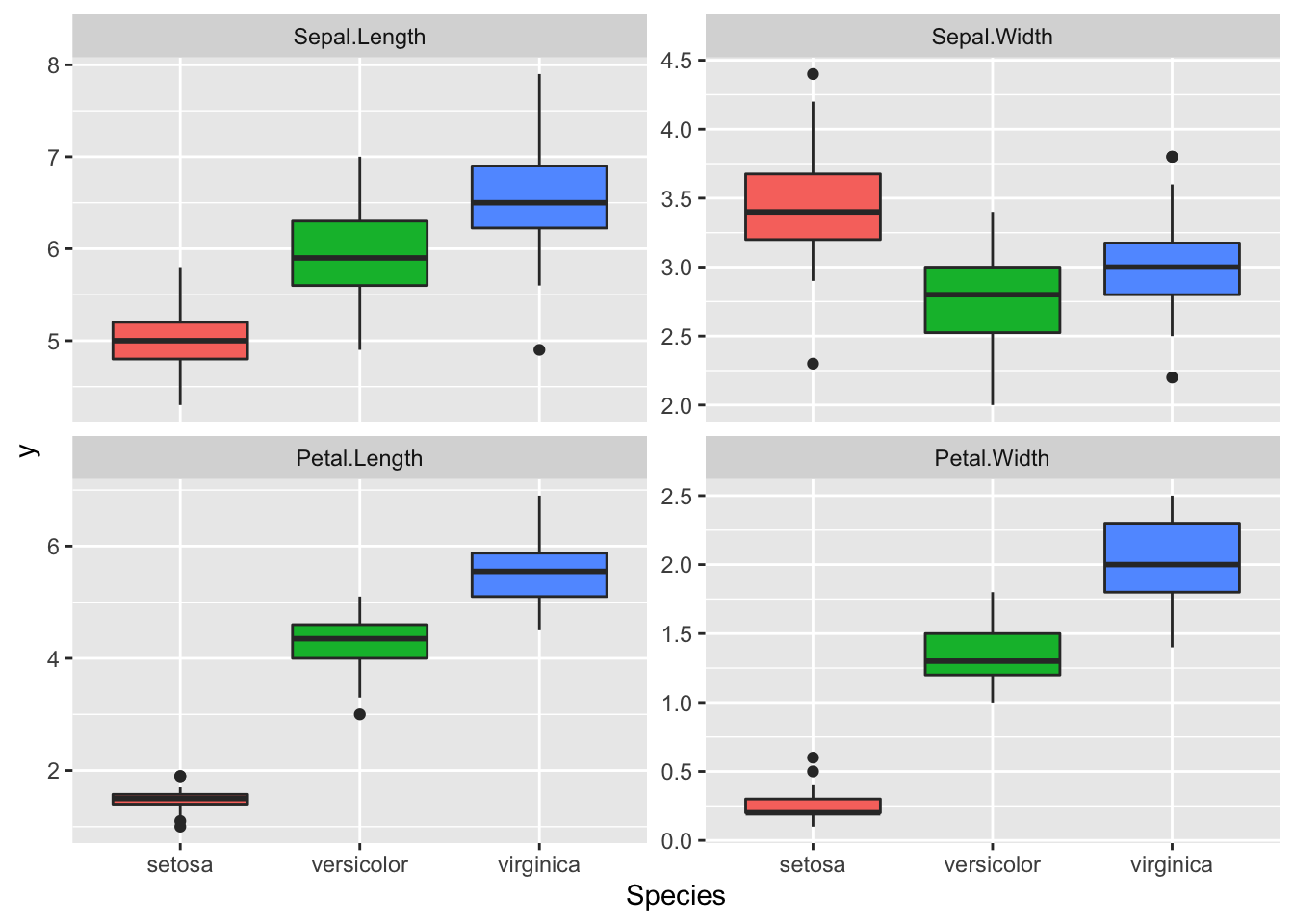
Great data, we can see a lot of differences between the Species for these traits.
It seems that we may have some correlation between Petal Length and Width. We also have different amplitude for these traits this will certainly results in different phenotypic variance between the traits, so we need to scale these traits before the PCA.
DataSc <- data %>% select(-Species) %>%
     scale(x = ., center = TRUE, scale = TRUE) %>%
     as.data.frame() %>%
     mutate(Species = data$Species)
head(DataSc)
#>   Sepal.Length Sepal.Width Petal.Length Petal.Width Species
#> 1   -0.8976739  1.01560199    -1.335752   -1.311052  setosa
#> 2   -1.1392005 -0.13153881    -1.335752   -1.311052  setosa
#> 3   -1.3807271  0.32731751    -1.392399   -1.311052  setosa
#> 4   -1.5014904  0.09788935    -1.279104   -1.311052  setosa
#> 5   -1.0184372  1.24503015    -1.335752   -1.311052  setosa
#> 6   -0.5353840  1.93331463    -1.165809   -1.048667  setosa
16.2.1 Principal Component Analysis (PCA)
So let’s proceed for the PCA analysis, here we will use the prcomp function from R status package, so no need to call any package.
16.2.2 Saving results
Let’s save the important results in objects, so we could make some graphs with them.
1. Accumulate percent of the total phenotypic variance explained by the principal components (PC)
Perc <- 100 * PCA$sdev^2 / sum(PCA$sdev^2)

PercAc <- as.vector(rep(NA, times = length(Perc)))
for(i in 1:length(Perc)) {
  PercAc[i] <- sum(Perc[1:i])
  names(PercAc)[i] <- i
}
names(PercAc) <- c("PC1", "PC2", "PC3", "PC4")
PercAc
#>       PC1       PC2       PC3       PC4
#>  72.96245  95.81321  99.48213 100.00000
Oh these data are high correlated.
2. Correlations of the traits with the principal components (PC)
CorTraits <- PCA$rotation
rownames(CorTraits) <- c("SepLen", "SepWid", "PetLen", "PetWid")
CorTraits
#>               PC1         PC2        PC3        PC4
#> SepLen  0.5210659 -0.37741762  0.7195664  0.2612863
#> SepWid -0.2693474 -0.92329566 -0.2443818 -0.1235096
#> PetLen  0.5804131 -0.02449161 -0.1421264 -0.8014492
#> PetWid  0.5648565 -0.06694199 -0.6342727  0.5235971

LabelsPCA <- CorTraits %>% as.data.frame %>%
     mutate(PC1 = PC1 + 0.15, .keep = "unused")
3. Individuals scores for the principal components (PC)
ScoresSpecies <- PCA$x %>%
     as.data.frame %>%
     mutate(Species = data$Species)

head(ScoresSpecies)
#>         PC1        PC2         PC3          PC4 Species
#> 1 -2.257141 -0.4784238  0.12727962  0.024087508  setosa
#> 2 -2.074013  0.6718827  0.23382552  0.102662845  setosa
#> 3 -2.356335  0.3407664 -0.04405390  0.028282305  setosa
#> 4 -2.291707  0.5953999 -0.09098530 -0.065735340  setosa
#> 5 -2.381863 -0.6446757 -0.01568565 -0.035802870  setosa
#> 6 -2.068701 -1.4842053 -0.02687825  0.006586116  setosa
Great we got what we need to create our figures.
16.2.3 Figures
The first figure will be a barplot of the accumulated variances explained by the PC.
We will use the color red the PC selected to use at the next figures.
barplot(PercAc, main = "Variance explained by PCA",
        ylab = "Cumulative variance (%)", xlab = "Number of retained PCs",
        col = c("red", "red", "gray", "gray", "gray"))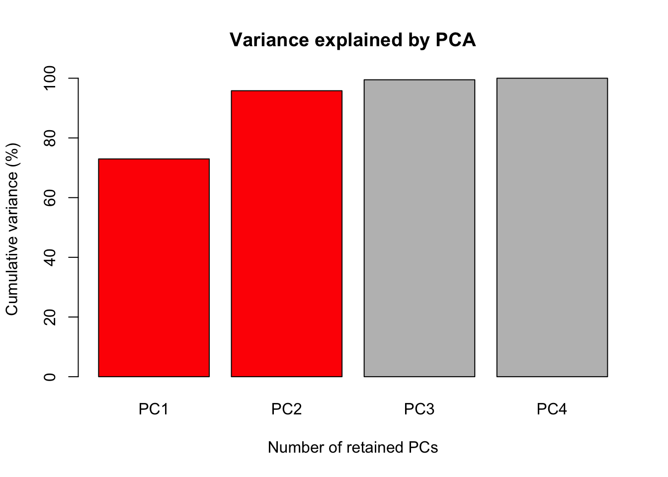
R markdown allows us to hide the code that create the figure, this could be done adding the argument echo = FALSE inside the curly brackets at the chunk. Using echo argument will print just the result of you chunk, link below.

The last figure will be a scatter plot of the individuals with their score for the first two PCs with the correlation of the traits with the first two PCs.
ggplot(data = ScoresSpecies, aes(x = PC1, y = PC2, color = Species)) +
  geom_point() + geom_rug(alpha = 0.2, size = 1.5) +
  geom_segment(mapping = aes(x = 0, xend = 3*PC1, y = 0, yend = 3*PC2),
               colour = "red",
               data = CorTraits %>% as.data.frame,
               arrow = arrow(type = "closed",
                             length = unit(0.2,units = "cm"))) +
  geom_text(mapping = aes(x = PC1*3, y = PC2*3, label = rownames(LabelsPCA)),
            data = LabelsPCA, colour = "black") +
  theme_bw() +
  xlab(paste("PC1 - ", round(Perc[1], digits = 2), "%", sep = "")) +
     ylab(paste("PC2 - ", round(Perc[2], digits = 2), "%", sep = ""))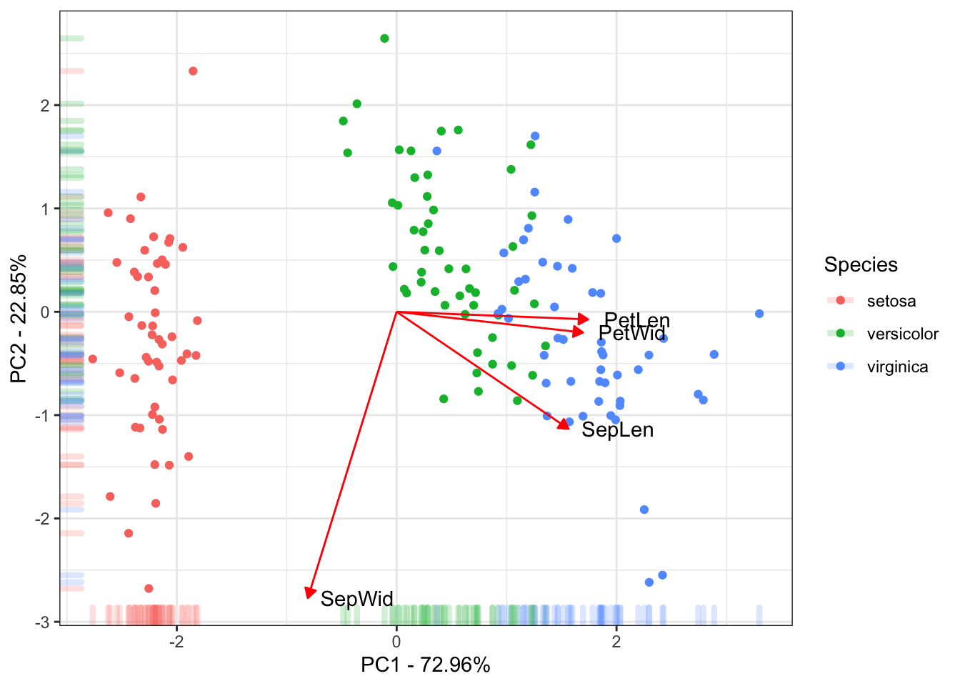
This is the final results of the PC. Mostly of the variance explained by the 1˚PC is due to the between species Setosa Vs Versicolor and Virginica. The 2˚PC just explain variance within the species. Also the traits Petal Length, Petal Width and Sepal Length could be used to discriminate the species.
Now you just have to commit these new updates, follow the steps at this link.